Early in 2003, Fluor Corporation, Fluor FCUs single-sponsor, was downsizing its staff and as a result employees were laid off. In an effort to diversify the future membership of Fluor FCU, the credit union set an objective to change its name. As a result of the change in name of the credit union, an image enhancement that included a new logo, slogan, newsletter, web site, marketing collateral as well as ATM and branch signage that complemented the new brand of the credit union must be created. The image enhancement design was to convey the values/brand attributes of the newly named credit union, such as; reliability, superior service beyond reproach, hi-tech hi-touch and people helping people. The graphic design elements created were to be of a masculine nature so as to appeal to the existing 75% male Fluor FCU credit union membership.
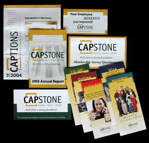
“Capstone”, created by Cuadpro Marketing, implies rock solid strength in terms of a financial institution from its meaning of the acme or crowning achievement as well as appeals with architecture/engineers of Fluor Corporation from its architectural meaning of the top stone of a building. The value of reliability in the Capstone name was conveyed to the membership through the creation of the slogan, “Built from a strong foundation”. This slogan was incorporated as part of the logo in April 2004 to assist in conveying the reliability behind the name of the financial institution that was created after 50 years of credit union history as Fluor FCU.
To convey the value of hi-tech hi-touch, the brochure series, introduced in May 2004, included a pocket in the back panel that included a die cut for a credit union employee business card as well as space to insert a membership application and additional brochures that provide applications as well as more detailed information on Visa, Online Bill Pay and Co-Op ATM services. To give new members a sense of superior service, a separate coupon was developed and inserted into the back panel pocket of the brochure that provided a 1.00% APR discount on a new or used vehicle loan or an additional .25% APY on a share certificate funded within the first 90 days of membership. The image of the expanded family for the front panel of the brochure was selected to provide a visual for how the credit union membership can benefit the members entire family as a means of conveying the value of people helping people. To convey reliability, the copy inside the member service brochure was positioned utilizing words and phrases, such as; apex, solid foundation, members are the bedrock of our credit union to communicate to members as well as prospective members that the credit union was a strong financial institution. Due to a high percentage of male membership in the credit union, the graphical design of the brochure was created with masculine colors and a unique sleek look to assist in establishing a bond with the engineers and architects of Fluor Corporation while introducing them to the new brand of Capstone FCU. The new logo with slogan will be introduced across marketing collateral brochures as they are reprinted. Currently, it has been incorporated into the Visa and CO-OP ATM brochures but not the Online Services or Member Service brochures.
To convey an image of hi-tech hi-touch to the members and prospective members of Capstone FCU, the new web site was designed with architecture that provided for ease of navigation as well as a clean design that enhanced the members online experience. To provide consistency across all marketing communications, the brand promise of the credit union, the slogan, “Built from a strong foundation” was placed on the header of each page of the web site to reinforce the reliability of Capstone to the membership. To increase the convenience of doing business with Capstone FCU, animated GIFS were added to the home page for members to take advantage of current promotions with direct links into online loan applications. The imagery of a family was added to the banner of each page so as to promote the feeling of not just helping one member with their financial goals but their whole family.
To reach the broadest audience of the existing membership the creative approach to the design of the newsletter was selected to reinforce the notion of superior service beyond reproach with an inviting and easy to read layout. The subject matters for the newsletter on financial education were selected to reinforce the value of reliability in the marketing communications of the credit union that assisted the membership in becoming more financially stable.
The branch and ATM signage was created with an emphasis on the Capstone logo. The clear acrylic backgrounds for the signage were selected to reinforce the visual of the color logo in the branch to establish recognition with the membership of the new Capstone logo.